Typography I Project: Words to Live By

According to the project brief for an assignment I worked on at the Savannah College of Art and Design, the objective of Words to Live By was to:
“Begin to understand and gain basic typesetting knowledge. Look at your letters from a 360º view. Understand and analyze the spacing above, below, and between letters.”
For this project, we had two physical deliverables:
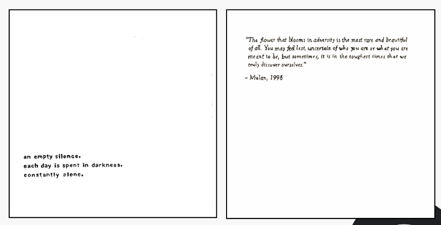
An 8x8 tracing of a quote mounted on illustration board — something we hope 2025 brings.
A 10x10 tracing of a haiku, also mounted on illustration board — inspired by how this quarter is going for us.
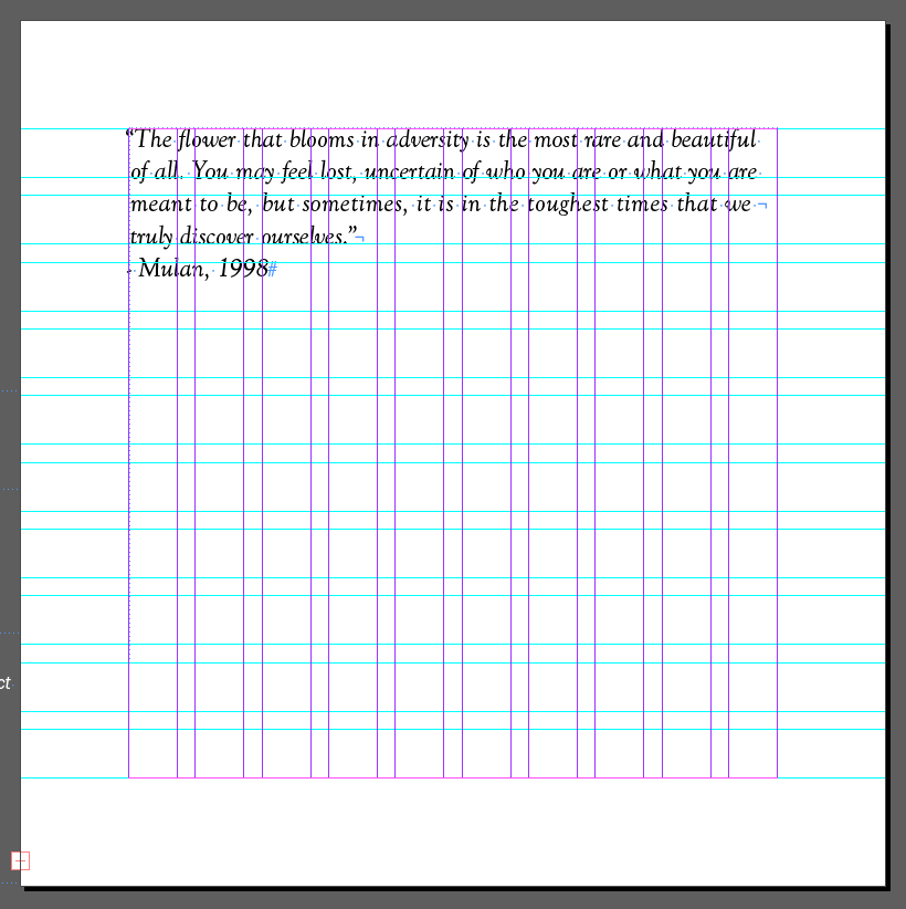
The quote needed to be typeset in Goudy Oldstyle Italic, while the haiku would be done in Acumin Pro Black.
Initial Thoughts
This year, I’ve really been into vision boards, Pinterest, journaling — basically, all things that help me grow and improve myself. So honestly, this project came at a really good time. I was excited to dive into researching quotes that could help me stay on the path I want to be on. I also love doing work by hand. I think you really learn a lot when you step away from the computer and get into the physical process.
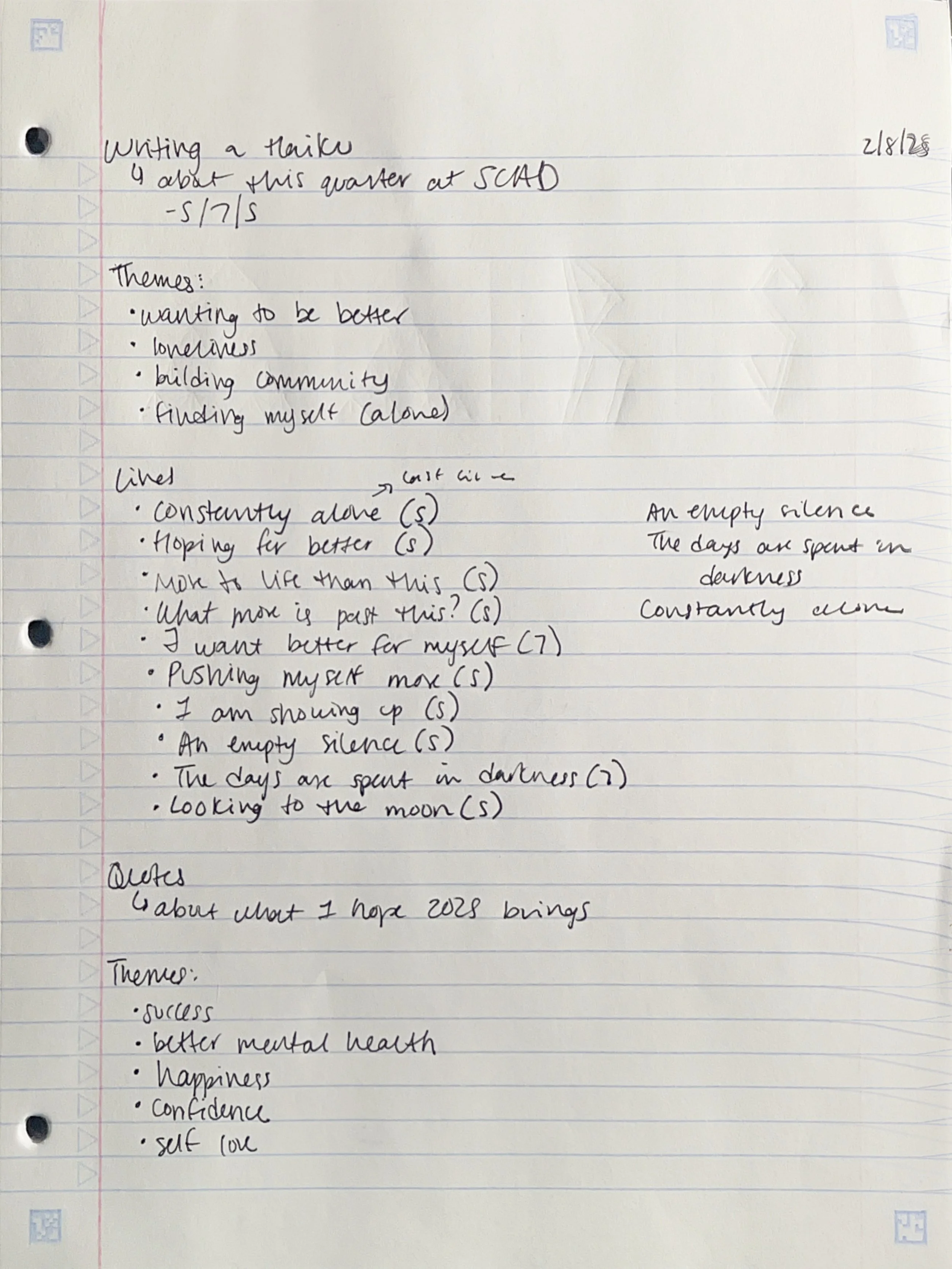
Step One: Finding the Words
The first step was choosing a quote and a haiku that fit the brief. I decided to write my own haiku based on my experience this quarter. After living with my boyfriend for three years, he recently had to move to Hawaii for six months for work. It’s been hard. I’ve been feeling super lonely and down, especially since I don’t have much of a community here in Georgia. So I let those emotions guide the haiku I wrote.
For the quote, I wanted something uplifting — a reminder for this year. I searched for Disney quotes about growth and self-work and eventually landed on one from Mulan that really resonated with me. It felt like exactly what I needed to remind myself of this year.


Step Two: Tracing and Measuring
Next, we traced our haiku and carefully measured the leading and tracking by hand on tracing paper. I chose 20pt type for the haiku because the text feels intimate and a little sad, and smaller type seemed to reflect that mood better.
Step Three: Into InDesign
Then we brought our quote into InDesign. Honestly, I thought I was going to hate this part (I’m not a big InDesign fan), but my professor gave us a really clear walkthrough, and I didn’t actually mind the process. It was surprisingly straightforward for what we needed to do.
Step Four: Back to Tracing
After setting the quote digitally, we printed it and retraced it by hand on tracing paper. We had an in-progress critique in class, and I got some helpful feedback from my professor on how to handle the hanging elements of my quote. Then it was time to ink over our pencil sketches — definitely my favorite part of the process.

Step Five: Scanning + Printing
Once our tracings were approved, we scanned them into Photoshop and printed out the final versions. It felt so satisfying to see the work come to life at this stage.
Step Six: Mounting the Final Work
Finally, we mounted our tracings and scans onto illustration board. Having the physical, finished pieces in hand made the process feel complete and tangible.

Final Thoughts
Like I said at the beginning, this project came at a really fitting time for me. Writing my own haiku and finding an inspirational quote I actually connected with helped me reflect and feel a little more grounded. I especially enjoyed working by hand — and I want to continue to get even cleaner with my linework and inking in future projects.
(Shockingly) I didn’t hate working in InDesign this time. If you’d told me that before we started, I wouldn’t have believed you.
Overall, I really enjoyed this project. It pushed me to be more intentional with both my words and my type — and that’s definitely something I want to keep carrying forward.