
Designing the Reading Experience: A Complete Typographic Transformation

For my sixth project in Typography I at SCAD Atlanta, we were tasked with a challenging yet rewarding assignment: redesigning a book cover using only typography, black and white, and simple shapes. On top of that, we typeset a chapter of the book, physically created and bound it, and then photographed the final product.
According to the project brief, this project “focuses on the traditional functions of typography to integrate information, create legibility, sequence, lend ‘voice’, and bestow credibility. Text typography is essentially a subtle activity and a circumscribed medium but there is nonetheless a great deal of room to maneuver within this context.”
This was actually the project I was looking forward to the most, but at the same time, the most intimidated by. I had been excited to choose books I had an emotional connection to, as I felt like this would enhance my enjoyment of the project. I also have an interest in creative writing and wanted to be able to self-publish a book in the future, so I knew this would help me a lot. I could actually already see myself doing this project again outside of class.
Before I could start designing, I had to carefully study existing books. I selected three published titles to analyze, along with the book I would ultimately redesign and typeset. The purpose of this was to observe and compare layout choices, typographic systems, and the overall tone conveyed by design.
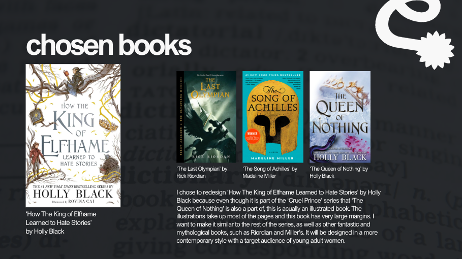
I studied three books for layout analysis. Looking at each one gave me insight into how type choices, margins, and spacing can drastically alter the reading experience:
‘The Last Olympian’ by Rick Riordan
‘The Song of Achilles’ by Madeline Miller
‘The Queen of Nothing’ by Holly Black
I chose to redesign ‘How The King of Elfhame Learned to Hate Stories’ by Holly Black because even though it is part of the Cruel Prince series that ‘The Queen of Nothing’ is also a part of, this is acually an illustrated book. The illustrations take up most of the pages and this book has very large margins. I want to make it similar to the rest of the series, as well as other fantastic and mythological books, such as Riordian and Miller’s. It will be designed in a more contemporary style with a target audience of young adult women. By comparing these alongside Holly Black’s book, I was able to identify where I wanted my project to align with fantasy/mythological styles while still updating the design to feel fresh and contemporary.


With the research complete, I moved into concept generation. This began with three layout concepts in Adobe InDesign that explored different approaches to margins, hierarchy, and flow. Alongside this, I created three typography options to test how various typefaces might influence tone.


Once I refined these, I developed spreads for class critique. Sharing work at this stage was helpful because it encouraged me to think about how my typographic decisions supported both the text and the target audience.
I also sketched out initial cover design ideas. Since the brief required using only typography, black and white, and simple shapes, I experimented with bold typographic treatments rather than relying on imagery. After narrowing down my sketches, I moved into digital mockups in InDesign, testing different typographic arrangements and cover structures.


After feedback and refinement, I finalized both my interior spreads and cover.


Then came the most hands-on part: actually producing the book. I printed, trimmed, and bound the pages together, making sure the craftsmanship reflected the level of care I had put into the design itself.
Finally, I staged and photographed the finished book. The photography was an important step. Documenting the project allowed me to present it not just as a set of digital files, but as a tangible, physical object that I had designed and created from start to finish.


Overall, this was definitely the hardest assignment we’ve had in this class. The most work was put into this one as well. And although there was more pressure on this project than the others, I am genuinely happy with my results from this assignment, and the entire class in general. I learned so much about InDesign, especially with this project. And I can honestly say (and I truly thought I would never say this) that I maybe like it now which is the ultimate testament to the quality of instruction and material we went over in this class. I will use what I learned, about InDesign, about typography, about craftsmanship, and about time management throughout the rest of my academic and professional career.