
Nature and Neverland with William Morris: A Color Theory Study
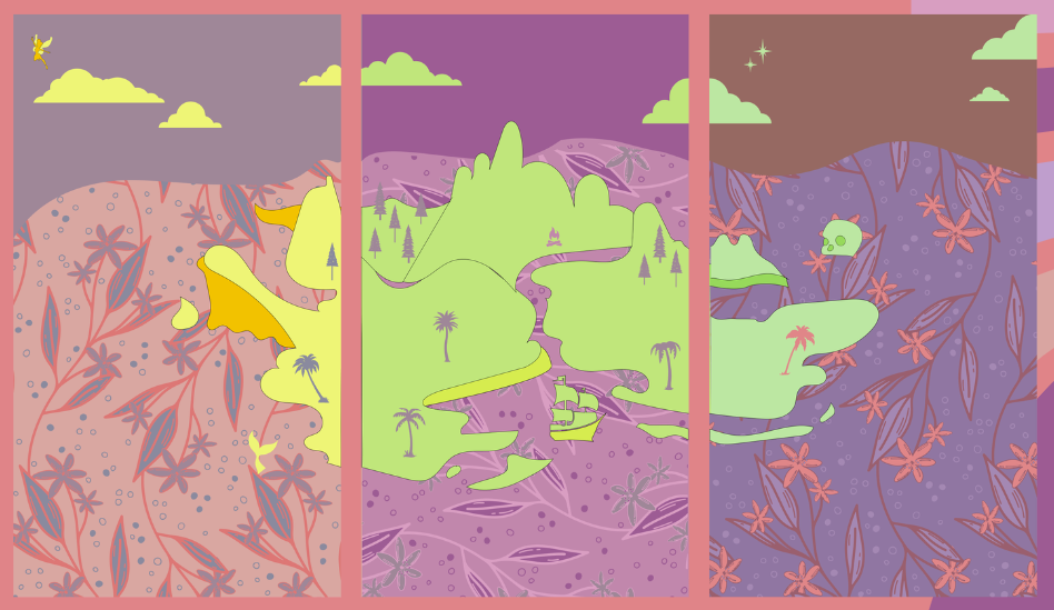
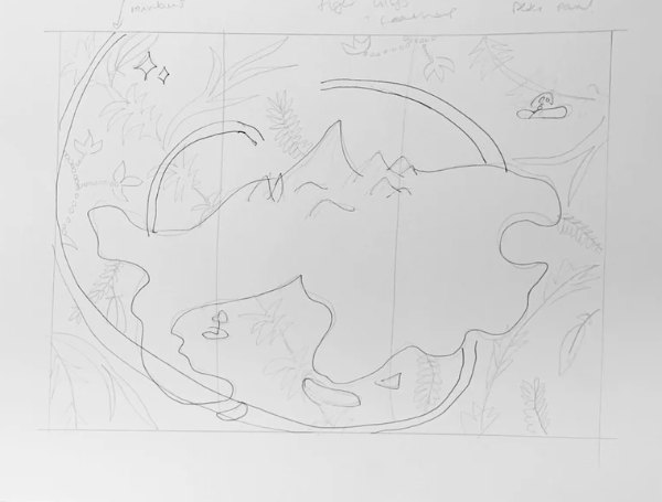
For my Color Theory class at SCAD, I explored the work of William Morris, a celebrated British textile designer. The assignment challenged us to study an artist from a curated list and translate their style into a triptych of our own. Inspired by both Morris’s romantic patterns and my lifelong love of Disney, I chose to design a map of Neverland.
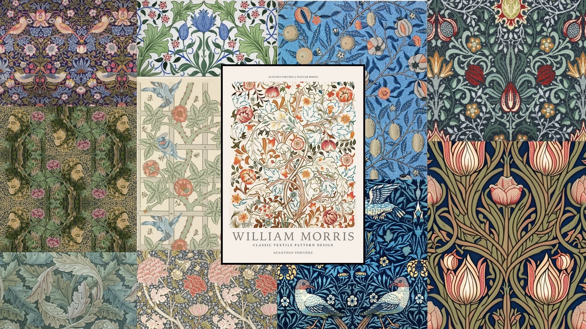
William Morris was a British textile designer in the 1800s who infused “romantic utopianism” (“Introducing William Morris, Victoria & Albert Museum”) in his work. I think this sense of romance really shows in his pieces. Morris often used muted colors which, according to Mental Health America, represent love, passion, and sensuality. This aligns with his passion for creating art that carried a sense of romance.
In terms of shape, Morris relied heavily on line (both straight and curved). Straight lines appear in his work to form grids and backgrounds, while curved lines bring his plants to life and add interest to the negative space. Beyond line, he used shape to create a wide variety of life forms. His pieces often include animals (mostly birds), humans, and lots of plants. What’s unique is that you don’t always notice these figures immediately. Sometimes it takes a second glance to find the people or birds hidden within the patterns.
Morris also created texture in thoughtful ways, using pointillism in select areas and adding line detail in others, such as on branches. His most important visual element was flowers, though his work as a whole is rich with all forms of nature and life.
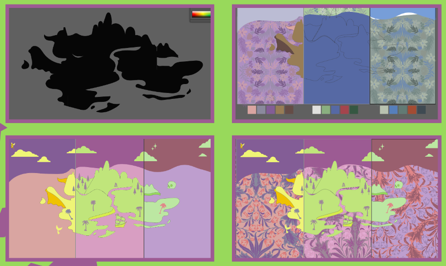
For this project, I combined everything I learned about color throughout the course with what was recently taught—the Bezold Effect. The Bezold Effect shows that colors can change in appearance based on their surrounding colors. In my work, this is especially visible in the pinks. In the first panel, the pink appears darker compared to the last panel, even though I didn’t use the exact same hue. The colors are similar enough to prove this effect in action.
We also learned about polyptychs, which are artworks divided into sections or panels. This project was my first time creating in this style, and I really enjoyed it. And printing it as three triptych panels for our class critique really brought it to life.
Overall, this project allowed me to apply both technical color theory concepts and creative inspiration in a meaningful way. By blending William Morris’s influence with my own interests, I created a piece that feels both personal and informed.