
Reimagining the Magic: A Brand Redesign for Merlin’s Magic Wand
For my second project in my Studio I graphic design class at the Savannah College of Art and Design (SCAD), I was tasked with selecting an existing brand and creating a thoughtful, strategic redesign that could live across multiple platforms. The goal of the project was not only to create a visually compelling identity, but to demonstrate brand discovery, concept development, and real-world application through digital, print, and merchandise design.
I chose to rebrand Merlin’s Magic Wand, a children’s nonprofit dedicated to bringing joy, connection, and magical experiences to children around the world through its partnership with Merlin Entertainments. As someone deeply interested in themed entertainment design, immersive worlds, and storytelling through visual systems, this nonprofit felt like a perfect fit. The project allowed me to explore how brand identity can enhance storytelling, clarify messaging, and create a stronger emotional connection while still respecting the heart of an organization built around joy and imagination.
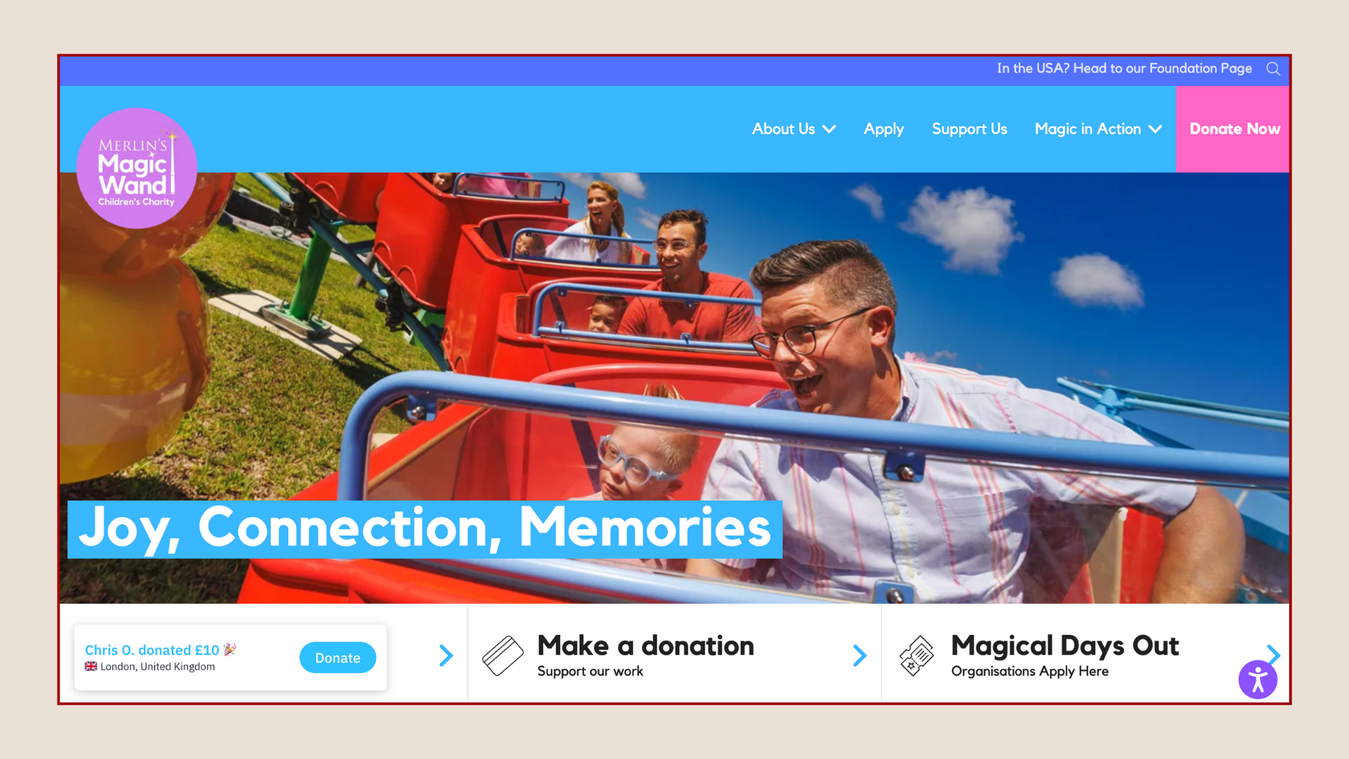
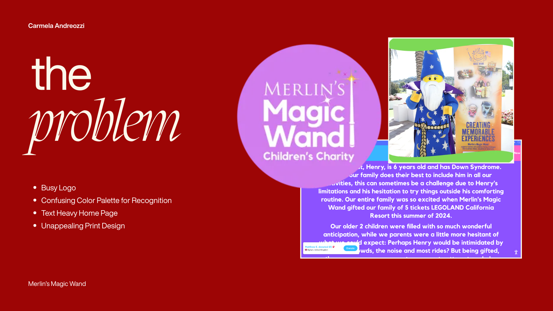
When I looked at their existing branding, I noticed several issues. First, their logo is very busy. It has a lot of text, and when paired with imagery, it becomes overwhelming.
The color palette is also confusing. When I think of Merlin, I picture his classic blue hat and robe. I associate deep red with medieval times and yellow or gold with magic. Bright purple, which they currently use, doesn’t convey the magic or the story of Merlin.
Beyond the logo, their website homepage is extremely text-heavy, which can be intimidating. Their print design also feels a bit naive and doesn’t convey the professionalism or magic I wanted their brand to reflect.
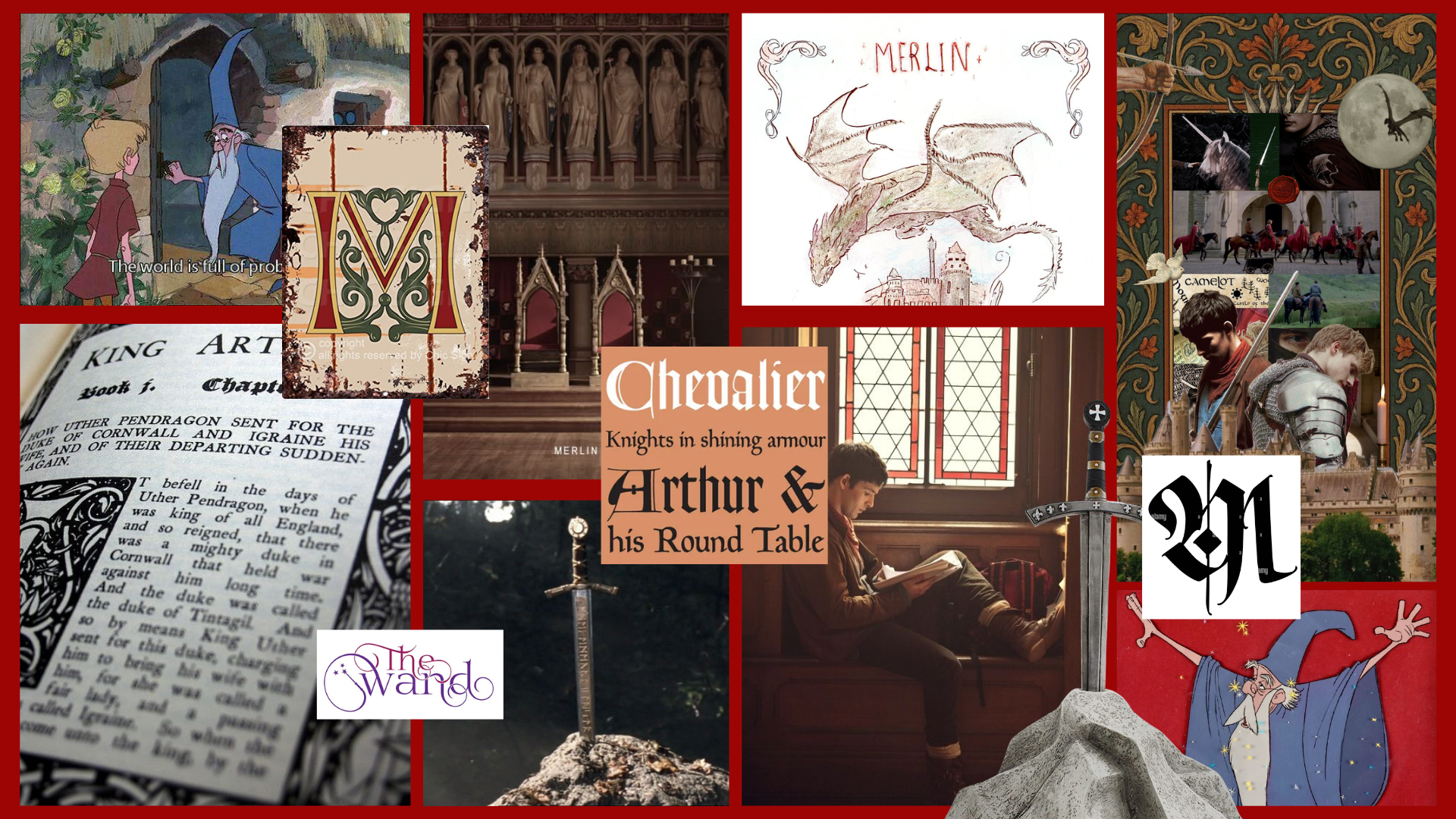
To start reimagining the brand, I created a vision board. I was drawn to the idea of medieval typography and the storybook quality that can communicate magic and wonder. I wanted a style that felt timeless, playful, and immersive while remaining clean and professional.
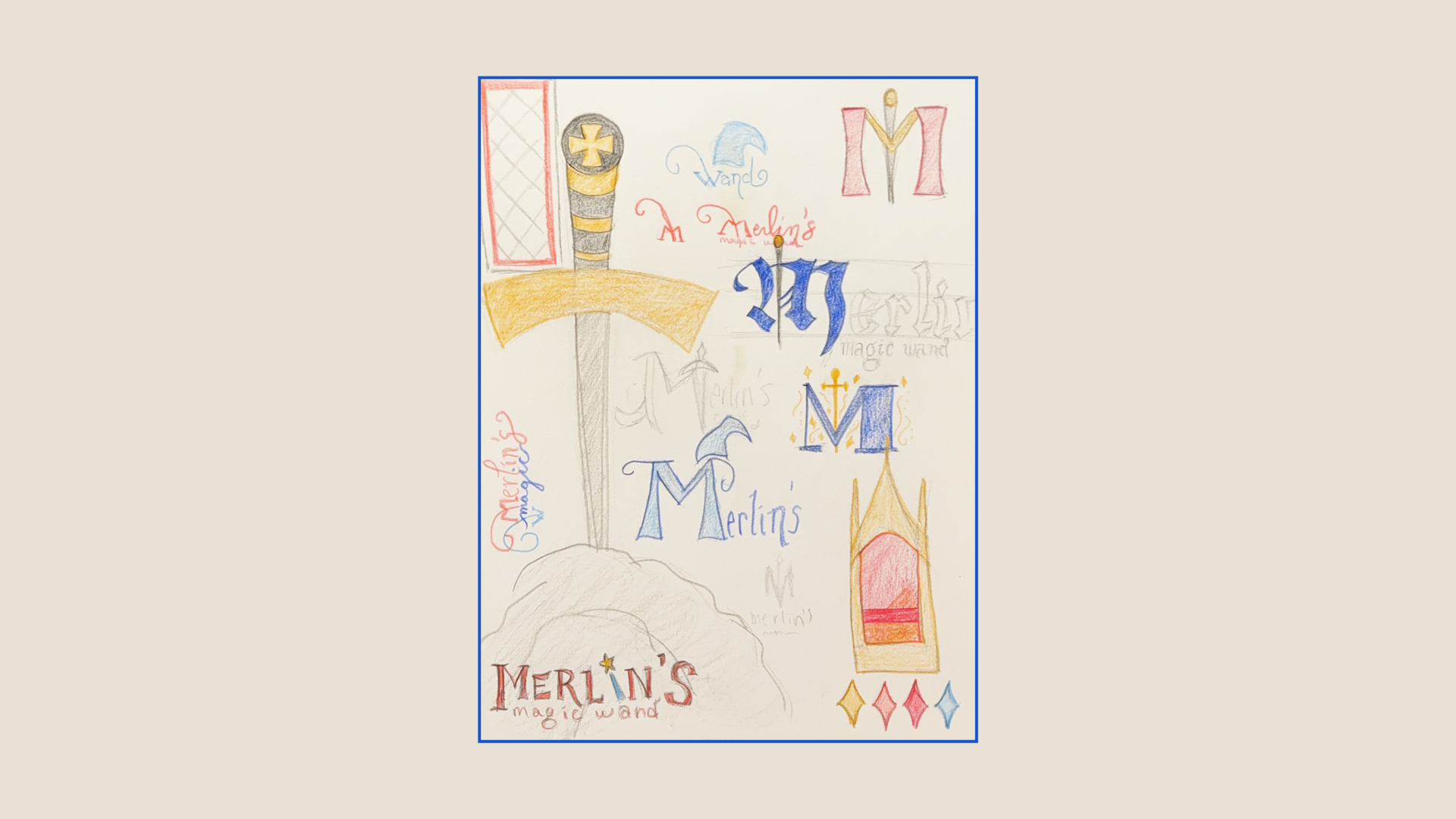
Next, I explored my initial sketches. I played around with medieval type design, experimented with sword and wand imagery, and also started thinking about colors.
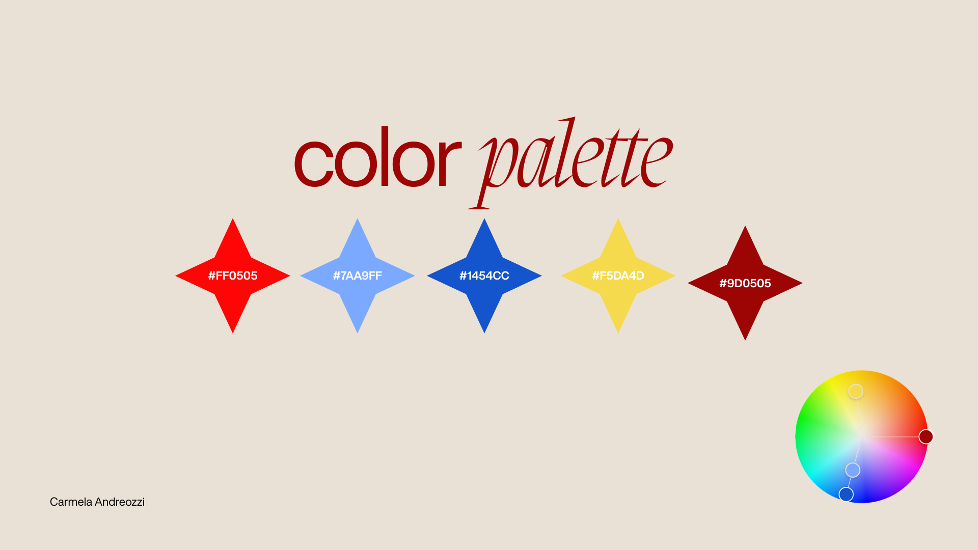
After exploring, I settled on a color palette that reflects the magic and medieval inspiration. I used blues to tie back to Merlin’s classic look, deep reds for the medieval feel, and yellow/gold accents to represent magic. This palette is cohesive and recognizable, helping the brand feel more grounded and on-theme.
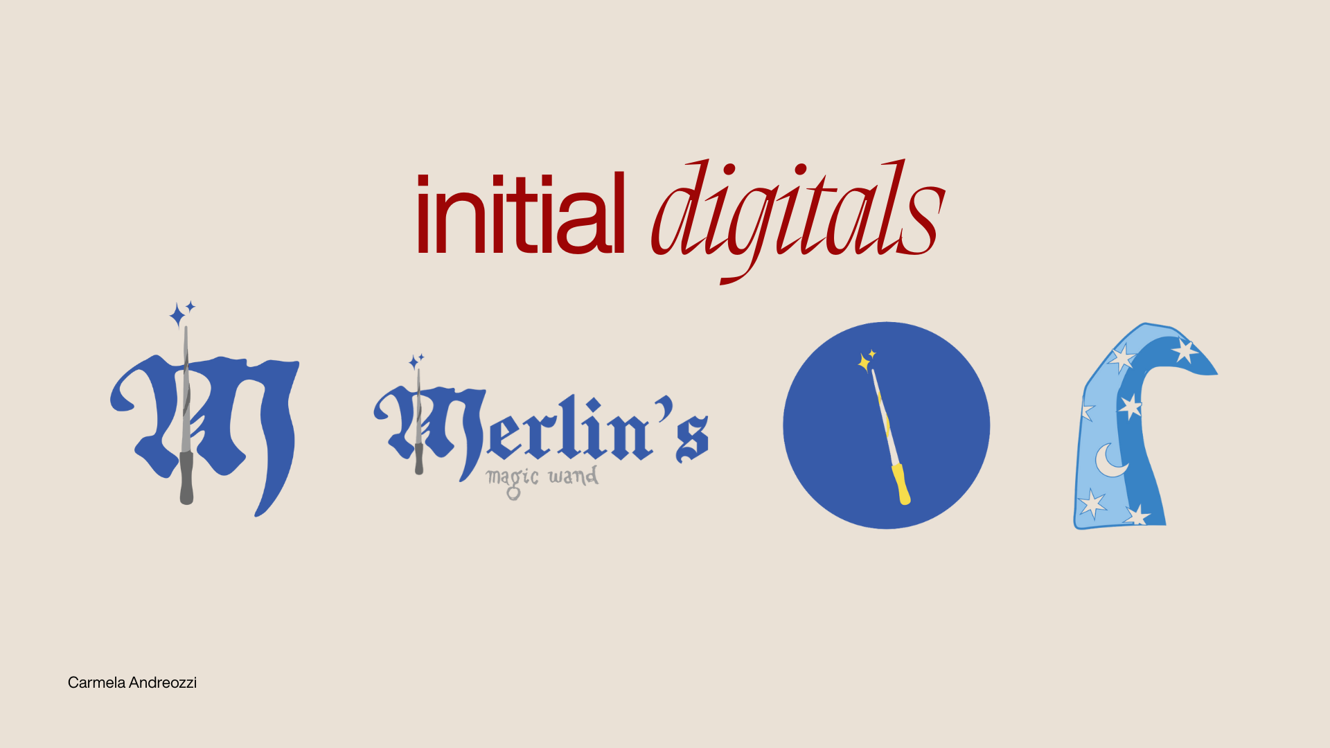
I translated my sketches into initial digital roughs. But after feedback, I decided to pivot slightly. Instead of using the wand as the main imagery, I chose to focus on Merlin’s hat. The hat is iconic, immediately recognizable, and gives a sense of whimsy and magic that works well for the nonprofit.
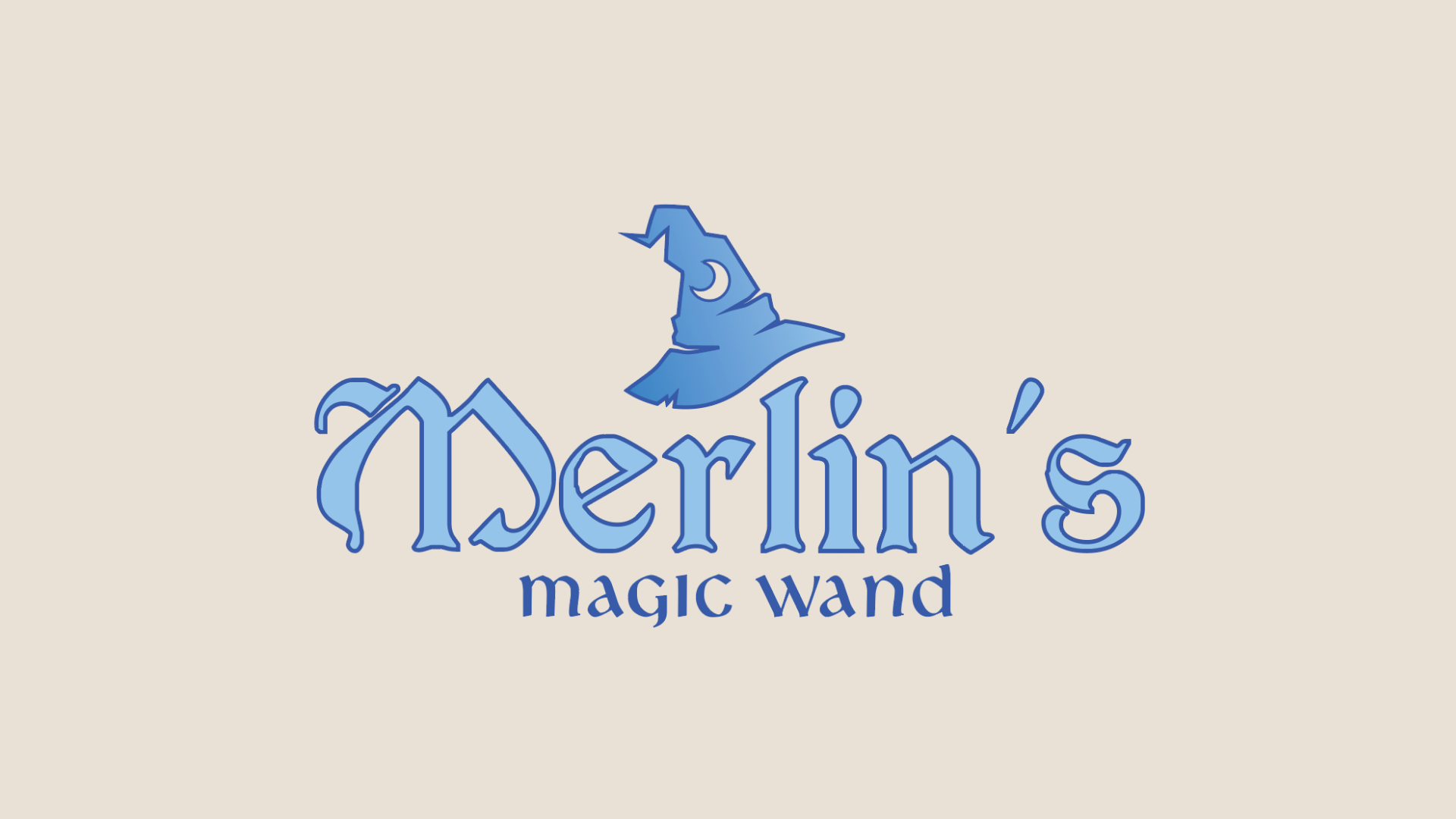
Here’s the final logo design. I simplified the text, focused on clear, legible typography, and used the hat as the central imagery. This version is versatile, works across digital and print, and communicates the magic of Merlin’s in a clear, memorable way.
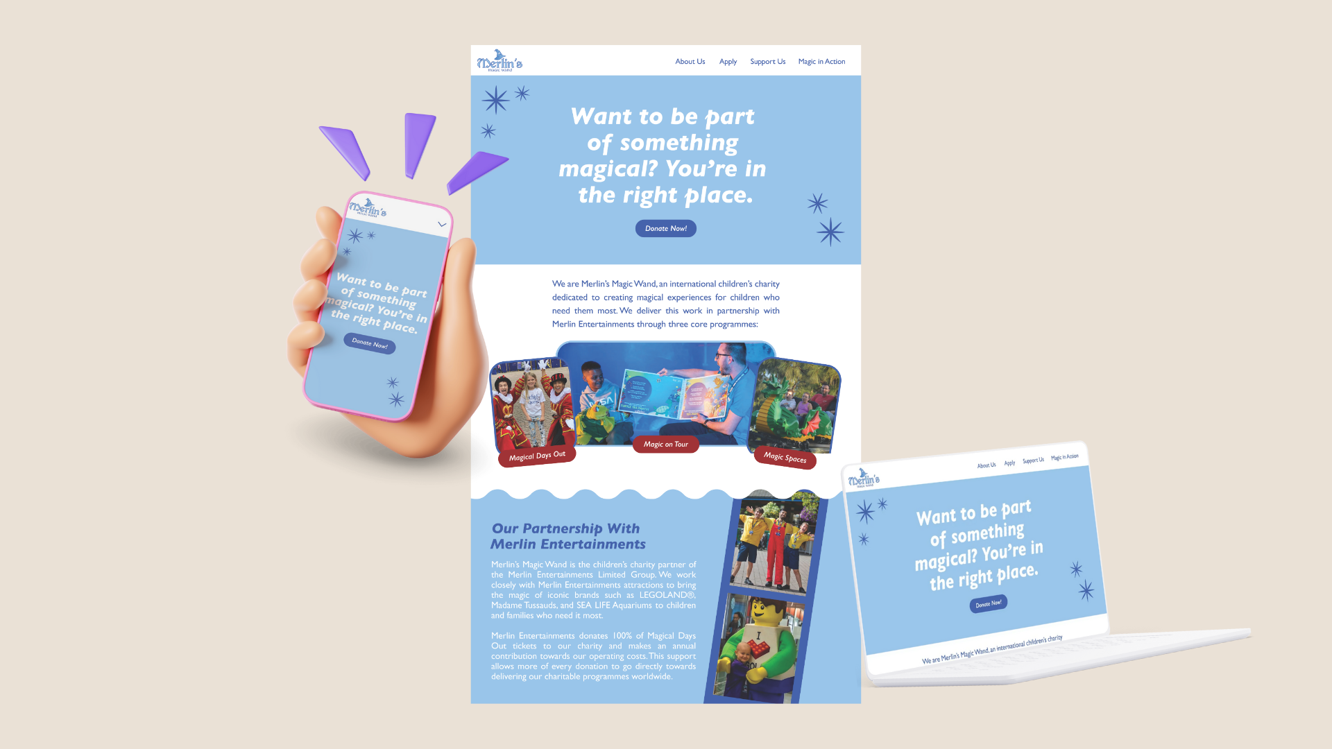
For the website mockup, I designed three pages for a desktop view and also created a digital phone mockup. My goal was to reduce text clutter, improve readability, and incorporate the new brand colors and imagery to make the site inviting and easy to navigate. I wanted a friendlier feel that was more welcoming than their current overwhelming website.
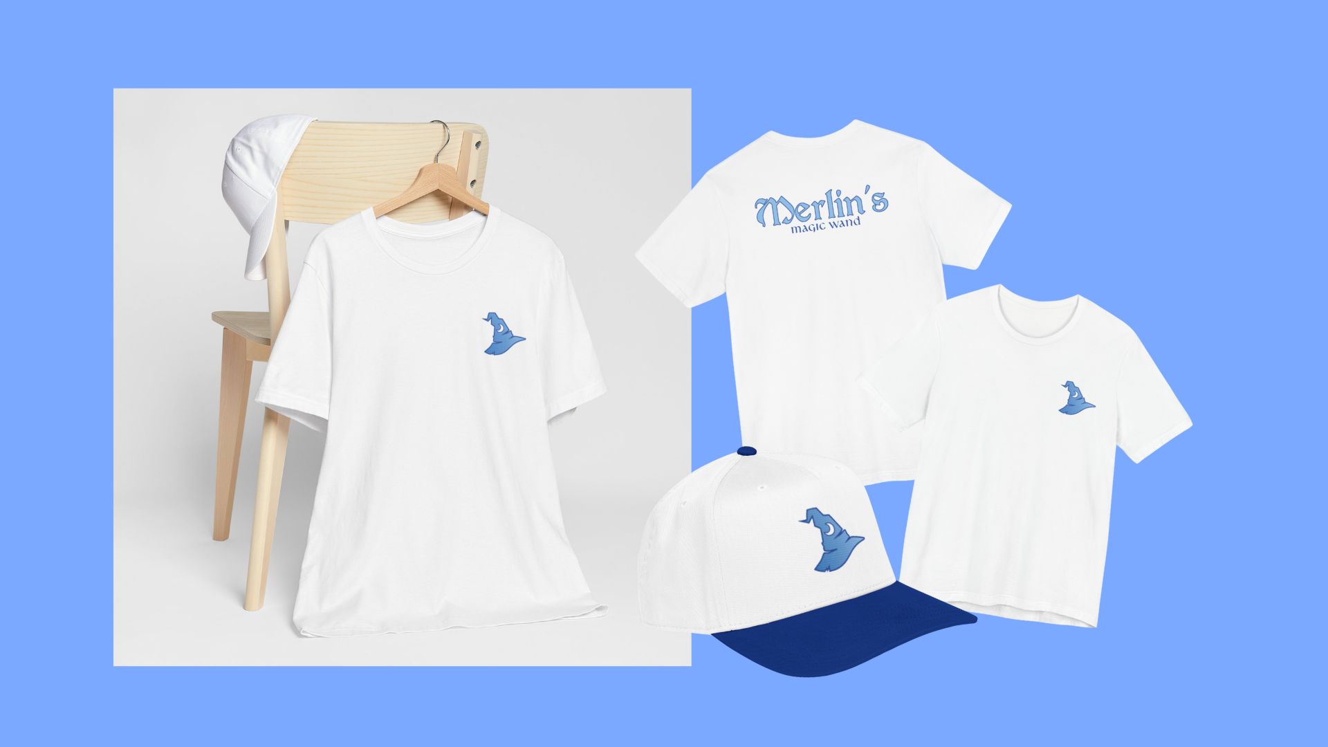
Next, I created merchandise mockups. These are designed for staff and volunteers to wear on trips and also serve as keepsakes. Using the logo and brand elements, the merchandise ties directly into the identity and helps promote the nonprofit.
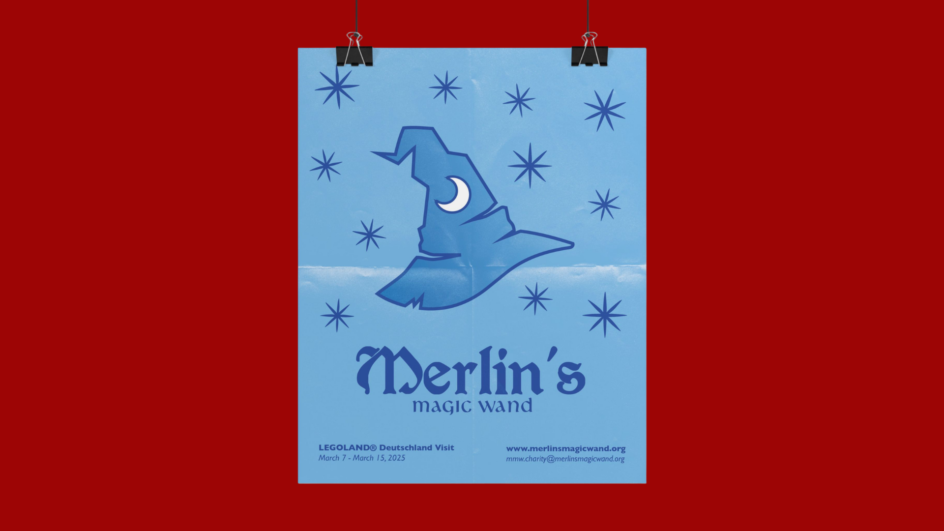
Finally, here’s a print mockup for a poster design. This focuses on the logo and brand identity rather than a specific event, making it versatile for multiple uses, including event postings and general promotional materials. The design is clean, professional, and communicates the magic of the nonprofit at a glance.
This project challenged me to think beyond aesthetics and focus on how design choices support recognition, usability, and emotional impact. From simplifying the logo and refining the color palette to designing a mock website, merchandise, and print materials, my goal was to create a cohesive brand system that feels magical, timeless, and adaptable. Most importantly, this redesign reinforced my passion for themed worlds and purpose-driven design. Working on Merlin’s Magic Wand allowed me to blend storytelling, branding, and real-world application in a way that reflects both my design values and my long-term career goals within themed entertainment.
Disclaimer: This project was created solely for an academic assignment at the Savannah College of Art and Design (SCAD). It is a conceptual redesign and is not affiliated with, endorsed by, or connected to Merlin’s Magic Wand or Merlin Entertainments.